
A long long time ago, I was a Stampin'up demo... I loved the colours, the stamp quality and ink pads. Then they did a change of rules about what you could post on your personal blogs and social media, so I left.
I still have a caddy with all my ink pads and I use them often. BUT, sometimes I like to try something new. It started with Catherine Pooler inks... OMG LOVE!!!!!
So vibrant and blendy and perfect.
Then I decided to try the Lawn fawn ones since I love everything else lawn fawn.
Sadly, I don't love these :(
I really wanted too with all my heart.
But it wasn't to be.
For several reasons, and here they are..
The colours don't match the lids - I hate that. The yellow I got is completely different.
They suck for blending, no matter what I couldn't really get a great blend.
They don't stack together - I could have let that go if the other stuff was great.
They are not "Juicy", I thought it might be just the yellow, but as I opened them they are all the same.
SO SAD!
But, I have made a few cards with them and I will hold on to them.
one positive is that the "walnut" ink is a great brown.
So here are the first of my cards...
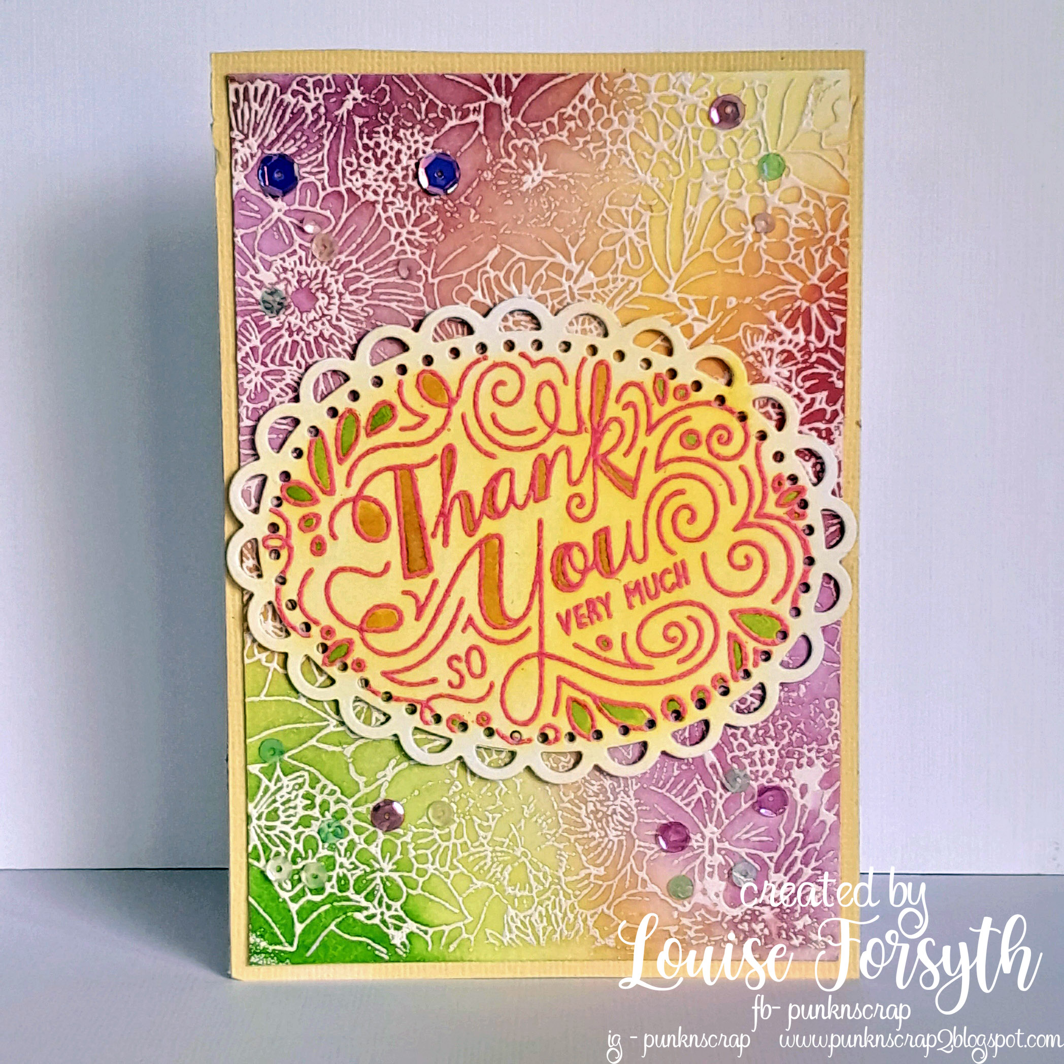

They do actually look more vibrant in person, but it has been a mission getting decent photos as it has done nothing but rain here for weeks. It is what I imagine living in England to be like.
I have to wear gumboots EVERYWHERE.
Anyway, thanks loads for popping by, I would love to know your thoughts on your favourite inks.
Lou
I have to wear gumboots EVERYWHERE.
Anyway, thanks loads for popping by, I would love to know your thoughts on your favourite inks.
Lou


I hear you on the inks Lou - I have a selection of L/F inks, but only because they were on special for the very reason the colours did not match the lids, and the retailer would not sell them full price because of that. I have found the C/P ink pads good, but the surface of the pads breaks down very easily.
ReplyDeleteFabulous cards that you have made - and yes, I hear you with the rain...
Blessings
Maxine